- Home /
- Product update /
- October
Product release update
Density
2 New Charts
Intercom
Welcome to our Metrikus product release update for October 2020. We’ve got lots of things to tell you about, so let’s dive right in.
What’s inside?
-
Density integration
-
New utilisation charts
-
Dials: aggregation selection
-
Custom capacity limits
-
Intercom on the website
Density integration
Let’s start things off with a bang: Metrikus x Density, the integration we’ve all been waiting for.
The need-to-know:
Density offers a highly accurate, completely anonymised people-counting sensor. Using a depth sensor, no information can be traced back to individuals who cross the sensor field.
We have now integrated Density into the Metrikus platform. This enables their accurate, anonymous technology as an option for Metrikus customers who want to prioritise accuracy, but also have the option of the additional anonymity.
✅ Super-accurate, industry-leading sensor
✅ Accuracy consistently over 95%
✅ No camera means ultimate privacy And let’s be honest – they look pretty nice, too.
New utilisation charts
In this release, we’re giving you not one, but two new ways of visualising your data. Aren’t we nice?
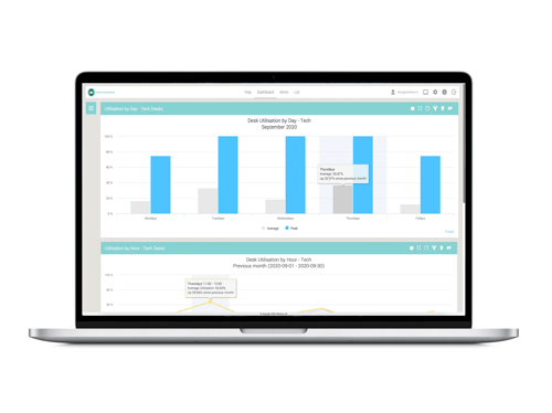
Occupancy utilisation: by day
You can now view utilisation data over a chosen period of time highlighting the average and peak utilisation across individual days of the week. You want to see average utilisation for all Thursdays during September? No problem.
Occupancy utilisation: by hour
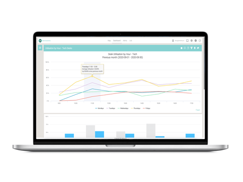
This chart helps you to view utilisation data over a chosen period of time highlighting the average and peak utilisation across each hour of the day.
So you can see your occupancy on all Thursdays in September, but you can also now see average utilisation between 11:00-12:00 across all those Thursdays, too.
Why these are great:
In these continually uncertain times, these visualisations could really help with efficient organisation of your space and teams.
For example, you could identify that a particular department rarely comes into the office on Fridays. At a glance, you could see that the space could be made readily available to other teams.
✅ Average utilisation values are calculated from the data within your building’s normal operating hours
✅ Get specific: see data for a particular floor, area or department
✅ All data is exportable as an Excel file for further analysis
Dials: aggregations selection
The need-to-know:
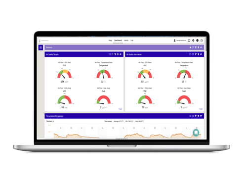
Dials have been updated and now allow you to select what type of aggregation you want applied to the data. Choose from mean, minimum or maximum.
For example, you can now create a dial to display the current maximum CO2 reading across all the air quality sensors within a space.
Why this is great:
✅ Further customisation and personal configuration of your dashboard
✅ See more meaningful values on the dials when looking at groups of sensors
✅ Use these visualisations to make more informed decisions
✅ Thresholds are visually displayed within the dials – see at a glance if the displayed values are within optimal range or not.
Custom Capacity Limits
The need-to-know:
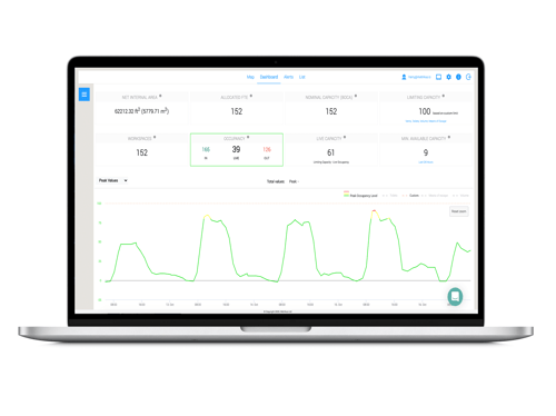
This one is short but sweet. We have added the ability to set your own custom capacity limit for each floor within a building.
Why this is great:
✅ Set custom limits you may now have due to social distancing restrictions
✅ New thresholds can be seen within the capacity panel
✅ The chart will highlight the times where this limit has been exceeded
✅ Allows for close monitoring where thresholds must be adhered to
Intercom
One last bonus update for you.
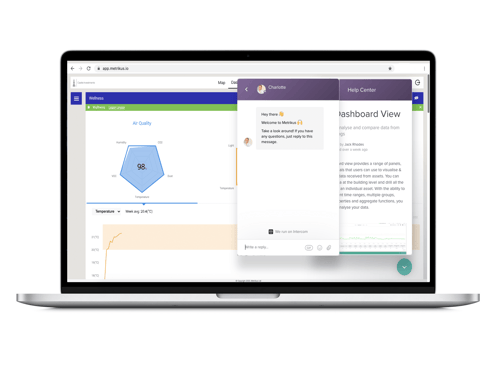
You may have noticed a little chat in the bottom right corner: this is Intercom, and it’s a new way for you to reach out to us. And yes, that really is Charlotte that you’re speaking to! No bots around here.
Why this is great:
✅ Reach us with any questions or queries, feedback or suggestions
✅ Let us know if you need any extra help setting things up
✅ The handy search function allows you to search our website for relevant information
✅ Get in touch for anything else you need!